Graphics Standards
ManualIssue No. 1
November 1, 2026
ManualIssue No. 1
November 1, 2026
Dan's
Coffee · Llano, TexasHow the name, the stripes and the colors get used. Hand this to whoever builds the website, paints the sign or orders the cups.
0.0
About Dan's
Dan Ruiz started roasting coffee in a tin shed behind his filling station on Highway 29 in 1968. The station is long gone. The shed, the roaster and the stripes on the sign are still here.
The look is from that sign: three stripes, gold, orange and red, running down the road and turning up into the sunrise. This manual keeps it that way. Nothing here needs to be modern. It needs to be consistent.
- 1.0 The logo, built
- 2.0 Logo versions
- 3.0 Color
- 4.0 Type
- 5.0 Patterns
- 6.0 Icons
- 7.0 Photography
- 8.0 Out in the world
- 9.0 On the website
1.0
The logo, built
- 1.1 The gridEverything sits on a 14-unit grid: baseline, x-height and cap height.
- 1.2 The name"Dan's" in Bagel Fat One, set to 252 units wide. Always with the apostrophe.
- 1.3 Three stripes10 units thick, 4 apart. Gold, orange, red, top to bottom. Never in any other order.
- 1.4 The turnEach stripe turns up on its own radius: 22, 36 and 50. The road runs into the sunrise.
- 1.5 The line under itCOFFEE · LLANO, TEXAS · SINCE 1968, in Archivo ExtraBold.
2.0
Logo versions
- 2.1 PrimaryUse it wherever it fits. Signs, the website header, the can.
- 2.2 StackedSquare spaces: cups, social, the stamp on a bag.
- 2.3 The DSmall places only. App icon, favicon, a hot iron on a crate.
- 2.4 SealStickers and the lid of the can.
- 2.5 Clear spaceOne stripe-and-gap (14 units) on every side. Nothing gets closer.
3.0
Color
- 3.1 The stripesGold, orange, red. They only ever appear together, in that order.
- 3.2 The everyday pairPercolator brown on creamer. Most of what we print is just these two.
- 3.3 AvocadoFor the menu board, the apron and not much else.
- 3.4 ContrastBody text needs 4.5:1. Orange is for big headlines only. Tap a color to copy its code.
Approved pairings, contrast measured live
4.0
Type
- 4.1 Bagel Fat OneThe name and the big headlines. Short words only. Never in all caps.
- 4.2 ArchivoEverything else: menus, body copy, buttons. ExtraBold caps for labels.
- 4.3 Courier PrimeRoast dates, notes and anything that ought to look typed.
- 4.4 Try itEvery line in the scale is editable. Type your own words in.
Aa
Bagel Fat One
ABCDEFGHIJKLMNOPQRSTUVWXYZ abcdefghijklmnopqrstuvwxyz 0123456789 &!?
Aa
Archivo
400 · 500 · 600 · 800
Courier Prime
ROASTED 10/29 · LOT 114 · DARK
Display · 72
Strong and honest.
Headline · 40
Roasted Tuesday and Friday.
Label · 14 caps
Highway 29 Blend · Medium · 12 oz
Body · 17
Dan roasted it dark because that's what the ranch hands drank. We still roast the Highway 29 Blend the same way, in the same drum, a few pounds at a time.
Typed · 14
Roasted 10/29/26 · Lot 114 · Best by Thanksgiving
5.0
Patterns
- 5.1 Four of themRacing stripes, starburst, highway waves and the diner check. Each one tiles.
- 5.2 WhereBag gussets, cup sleeves, the back of the menu, wrapping paper at Christmas.
- 5.3 The ruleTwo colors at a time, from the approved pairs. Try them below.
PatternColors
6.0
Icons
- 6.1 Drawn thick24-unit grid, 2.4 strokes, round ends. They should look like they came off a sign painter's brush.
- 6.2 ColorBrown, or cream on brown. Never in the stripe colors.
- 6.3 SizeNothing smaller than 18px.
7.0
Photography
- 7.1 Warm and a little fadedLike a print that sat in a shoebox. Real light, real grain.
- 7.2 Show the placeThe shed, the counter, the road. The coffee is never on marble.
- 7.3 SamplesThe three photos here are AI-generated renderings, used to show the direction until we shoot our own.
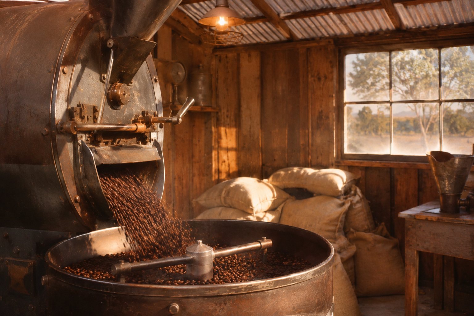 AI-generated rendering
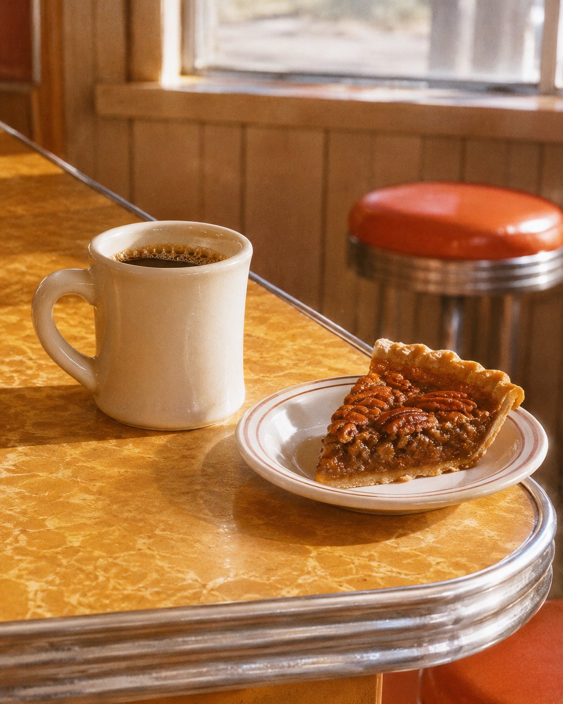 AI-generated rendering
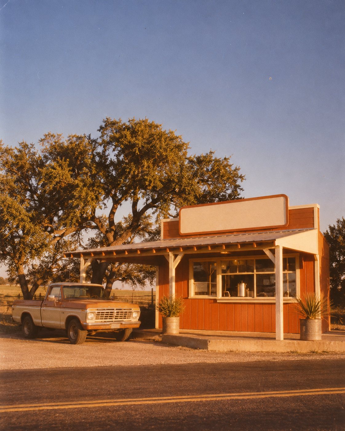 AI-generated rendering
Do
- Natural light, late in the day.
- Leave the dust, steam and scratches in.
- Hands, tools, trucks, the counter.
Don't
- No white studio backdrops.
- No latte art, no marble, no glow filters.
- Never put the logo over a busy part of a photo.
8.0
Out in the world
- 8.1 The canCoffee comes in a can, like it used to. The seal goes on the lid.
- 8.2 The cup and the mugStripes go around, never across.
- 8.3 The signOut on Highway 29. Brown board, cream letters, stripes running off the edge.
9.0
On the website
- 9.1 Four themesEach one passes AA contrast for body text. Pick one and the homepage changes with it.
- 9.2 For the developerThe matching CSS, Tailwind or JSON is under it. Copy it straight into the build.
Coffee the way Dan made it.
Roasted twice a week in Llano, Texas, since 1968. Strong, honest and never burnt.
Shop the beansHighway 29 BlendMedium · pecan, cocoa
Shop Pot DarkDark · molasses
Sunday MorningLight · honey, orange